ARitize: Design Evaluation

DURATION

5 Weeks

SKILLS

UX/UI Design
UX Research
Data Analysis
Copywriting
User Testing

Team

Bonnie Chen
April Diaz
Jasmine Wong

Tools

Figma
Google Suite

Context

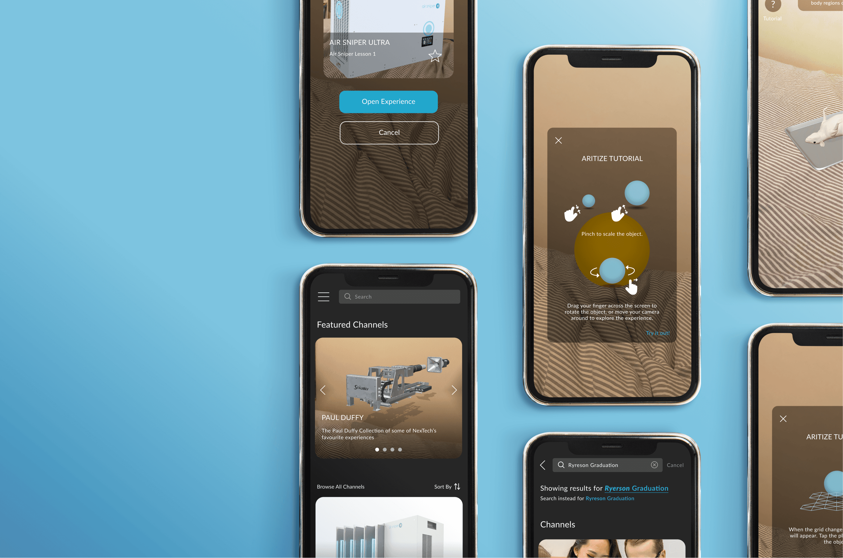
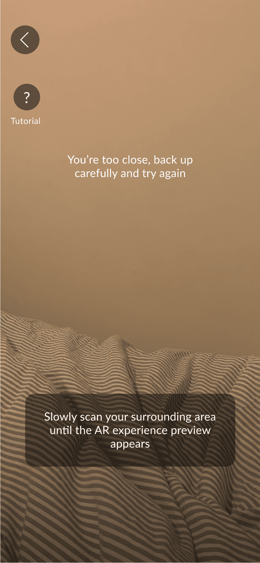
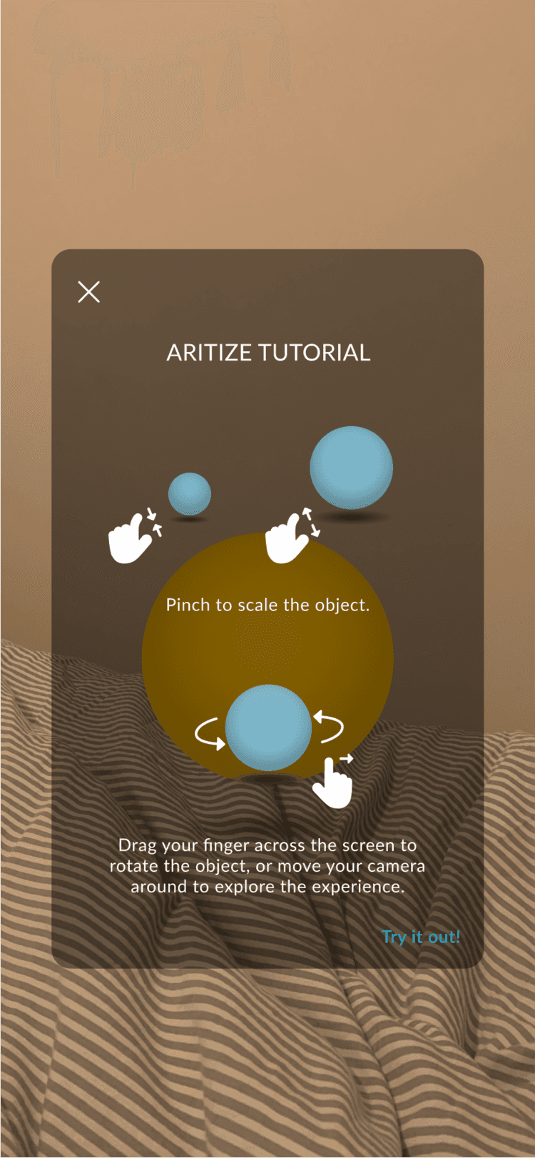
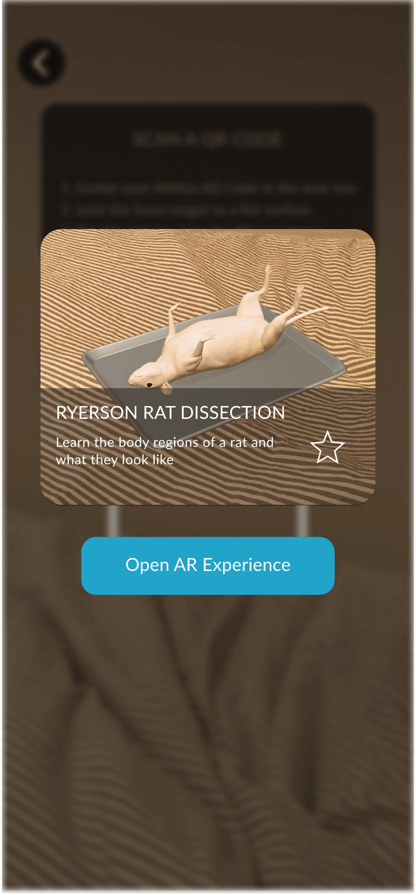
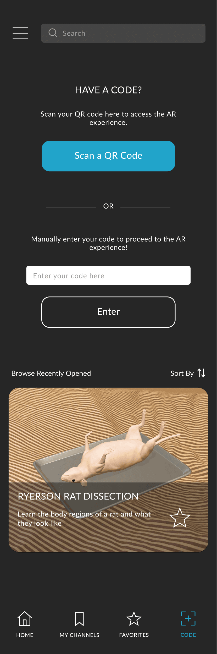
The learning objective of this project was to partner with a real-world organization and conduct a design evaluation of one of their products. We partnered with NexTech to analyze their product ARitize—an Augmented Reality (AR) mobile application. NexTech's design challenges for us were locating areas where users struggle within the app and aiding the learning curve for their novice AR users. We analyzed two portions within the ARitize mobile application: their public platform and AR experiences used by Ryerson University science students, which can only be accessed through QR codes.
Our design evaluation consisted of a usability study held virtually with 7 participants, a pre-test questionnaire to gauge new user expectations and their initial conceptual models, a post-test interview, and a post-test questionnaire to compare how users' conceptual models may have changed. Based on the data, we created a compilation and analysis and mock-ups of a potential redesign solution. We used a think-aloud method during the study to understand how the app’s interface causes complications for the user when completing a task.

Responsibilities

I assisted with the study analysis and was the lead UI designer for our re-design solution. We collected quantitative and qualitative data, which were compiled into a report with tables and charts to identify improvement areas within the app.
As the lead UI designer, I was in charge of creating mock-ups in Figma and used the results from our study to drive the UX direction for our re-design. Nielsen’s usability heuristics were referenced as additional guidelines to better support each design decision.

Analysis

The main pattern in our usability study showed that participants were often confused about how to complete a task, both with and without tutorial information available in-app. This was part of ARitize's overarching issue regarding interaction and interface clarity.
For example, when viewing an AR experience, participants struggled with scaling an object to be larger or smaller on screen. Despite the solution being available to them hidden under a "?" button, they needed test facilitators to guide them. This pointed to an issue for new AR users and the learning curve they faced when navigating it for the first time. To increase accessibility to tutorial information, I incorporated an optional pop-up tutorial for new users when they view their first AR experience and added button labels (see gallery below).

AR Experience Camera Screen (Original)

The app uses a “?” button to access a tutorial. A majority of our participants were unable to recognize this button contained instructions to help them complete tasks.

AR Experience Camera Screen (Our Re-design)

The tutorial button is labelled for clarity and back buttons are now consistent throughout the app. On-screen prompts for each step are also emphasized and easier to read. We also included prompts to help users troubleshoot when needed.

AR Experience Tutorial Pop-up (Original)

ARitize's tutorial on how to view the selected AR experience. The relevant information (underlined with red) for a specific step is hidden away near the bottom of the screen.

AR Experience Tutorial Pop-up (Our Re-design)

We chose to create a step-by-step tutorial walkthrough for new users. This is one of the tutorial steps showing how to change the size of an object and how to rotate it, after a user has opened up an AR Experience.
Left arrow button.
Right arrow button.
Another point of interest was during the AR Experience of a rat dissection. When we asked participants to rotate the rat, almost 30% of participants mistook the reset button in the top right corner for a rotate button. When asked to navigate to a different area of the rat dissection, participants were unsure where to go. Rather, they blindly clicked buttons on the screen hoping one would help complete the given task. This data in addition to the points above demonstrated how clarity throughout the interface was needed for ARitize users. Buttons were labeled and an extra screen was added after scanning a QR code so users know what AR Experience they have scanned. Additionally, darker backgrounds were added to camera screen prompts such as the "Scan a QR Code" instructions and rat dissection navigation tooltip to increase visual accessibility (see gallery below).

QR Code Scan  Screen (Original)

ARitize's Code tab from their bottom navigation bar. This is where users go to open custom AR Experiences. These experiences cannot be saved in the Favorites tab of the navigation bar, and can only be opened through repeated scanning or manual entry.

QR Code Scan Camera Screen (Original)

Ryerson students are provided with QR codes to custom AR Experiences, which they can access through the app. These codes do not say what the AR Experience is outside of the file name and silhouette icon.

QR Code AR Experience Camera Screen (Original)

The original interface of a custom rat dissection AR Experience, which loads immediately after the QR code has been scanned.

QR Code Scan Camera Screen (Our Re-design)

We added a black background over the QR Code instructions to increase readability.

QR Code Scan Confirmation (Our Re-design)

We added an additional screen after a QR code has been scanned to show the user which AR Experience they are about to open. This also gives them the button (☆ icon) to save the AR Experience in their bookmarks which is not an option in the original interface.

QR Code AR Experience Camera Screen (Our Re-design)

We labelled buttons for interaction clarity based on study data and added a tooltip showing how to navigate different parts of the AR Experience upon loading.

QR Code Screen (Our Re-design)

We did not test for frequent accessibility of custom AR Experiences within the app. However, we did add a section in the Code tab to view recent custom AR Experiences based on Nielson's 6th heuristic of recognition vs. recall.
Left arrow button.
Right arrow button.

Results

Our report and design evaluation were well received by NexTech upon presenting our findings to them. The NexTech representatives informed us that the results of our design evaluation would be incorporated into improvement updates for the ARitize application.
Reflecting upon our process, I believe that there are improvements that could be made to improve our usability study. For example, I believe that our sample size of 7 participants was too small to best represent ARitize's user demographic and was restricted due to the time restraints of the case study. When analyzing participant recordings, I found that our think-aloud method felt too guided, helping participants more often than necessary to complete a task.
If I could redo this study, the first thing I would do is gather data from ARitize to see what the main demographics of their users are, such as the largest age group of their users or what devices they use the app on. With that information, I would be able to filter through possible participants to best replicate ARitize's main user base. I would also double the participant count. During the study, I would observe how participants explore the interface for longer before providing help, to gauge the severity of interaction and interface clarity. This would provide additional data on the time it takes users to come up with a solution and how it affects their overall experience with the app. I would also like to include a study with our app re-design to see the effectiveness of our design solution and note areas for further improvement.

View other projects

Left arrow button.The RemitBee logo.

RemitBee: Internship

UX Research, UX/UI Design
Left arrow button.Phone mock-up images showcasing several screens of Tempo, our case study.

Tempô: Interface Design

UX/UI Design, case study

Tempô: Interface Design

UX/UI Design, case study
Phone mock-up images showcasing several screens of Tempo, our case study. Right arrow button.